SARAH ROBERTS

WINNER DESIGN WEEK AWARDS 2020.
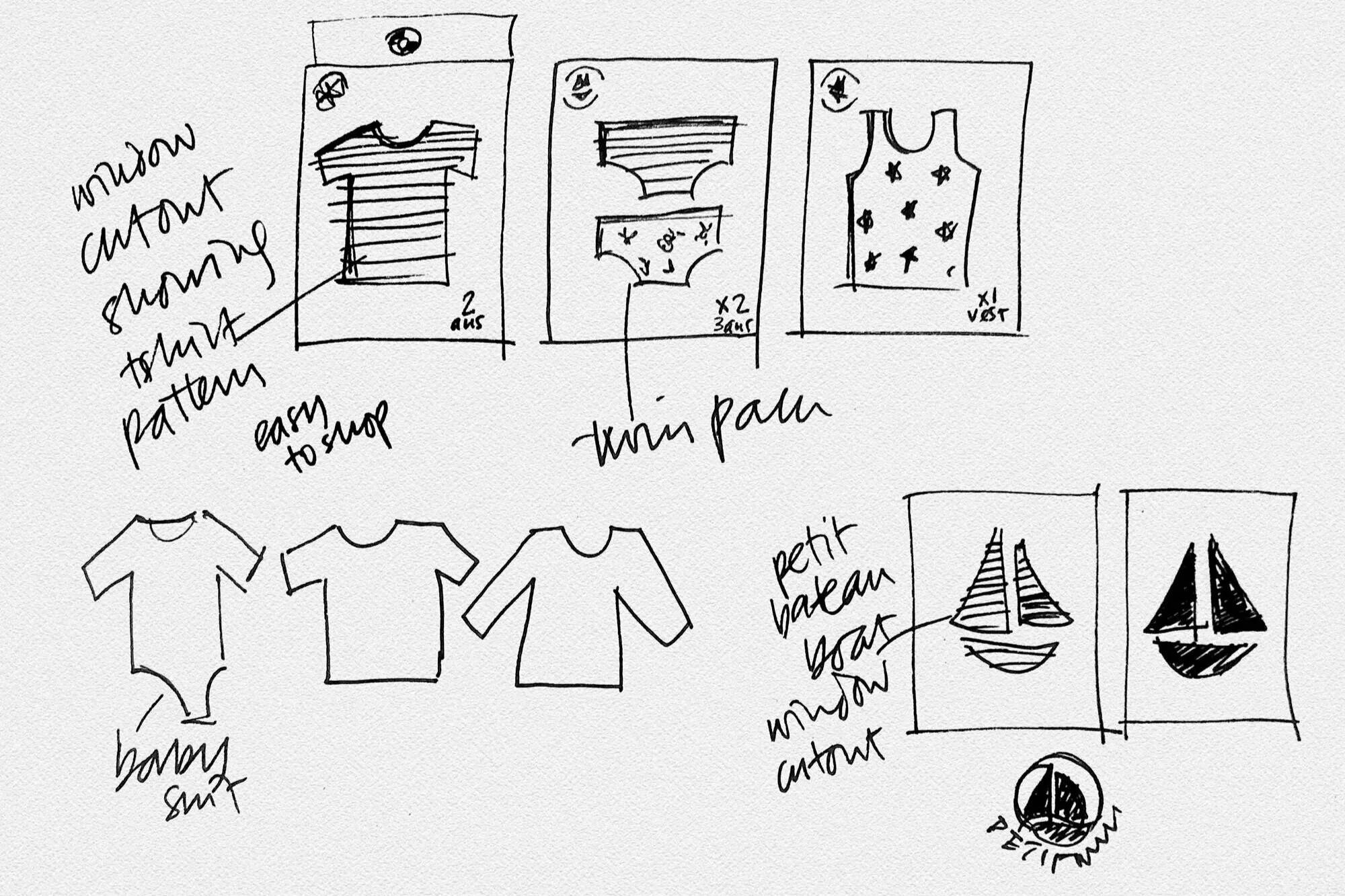
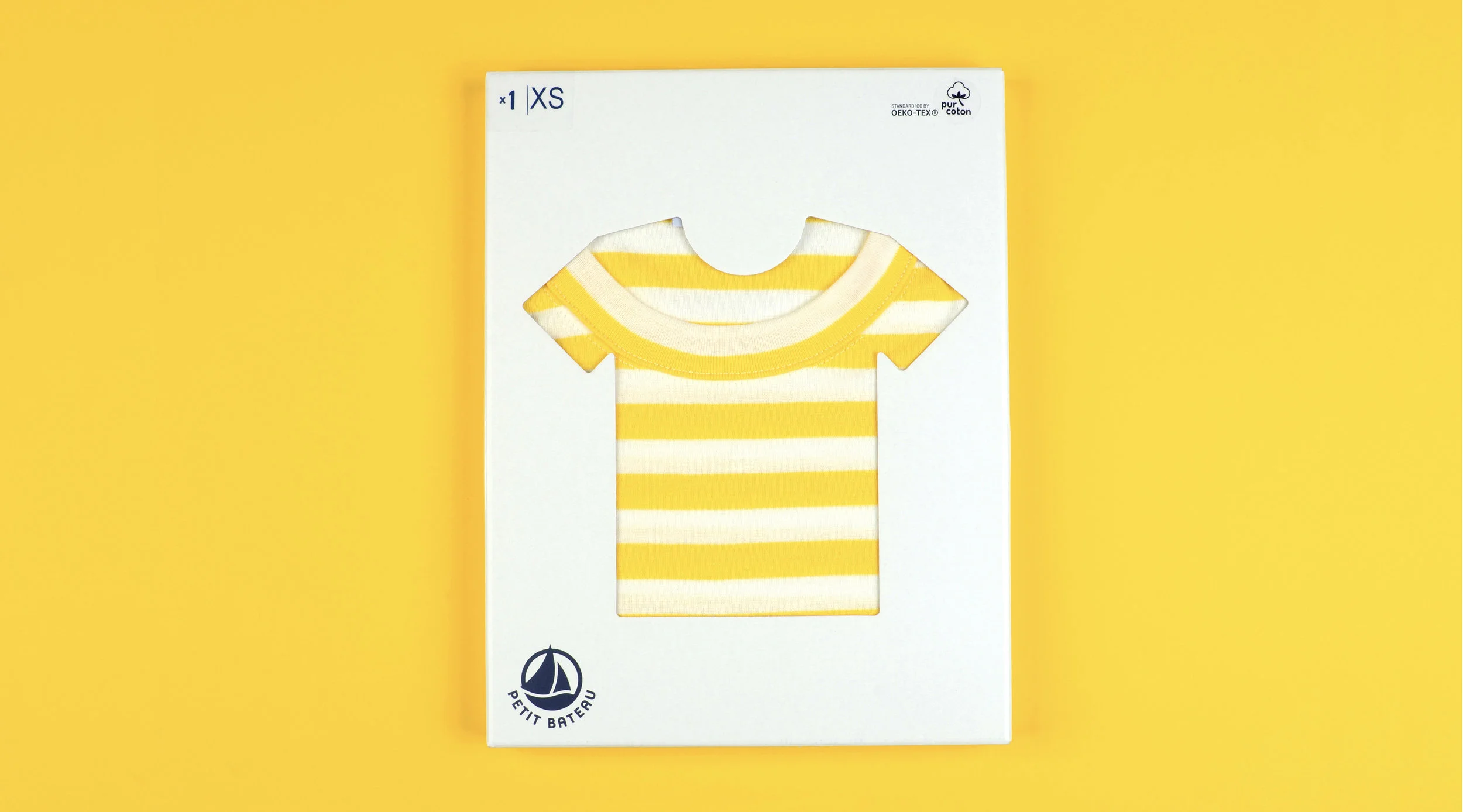
In the early 1900s, children and adults wore long woollen underpants - until Petit Bateau’s Étienne Valton had the idea of cutting off the legs of the underpants, thus inventing the world’s first knickers.
He then went on to invent the first baby bodysuit, inspired by t-shirts worn by American Soldiers.
So it seemed fitting to honour his inventions by creating packaging with a ‘cutout’ window - making it easier to navigate the shelves, and making the shopping experience more pleasurable.
What started out as a refreshing ‘limited edition’ for Mother’s Day, proved so popular that it became a permanent fixture in the Cowshed collection.
A sweet floral blend, this collection perfectly captures the layering and depth of the fragrance, whilst standing out amongst the classic Cowshed range.
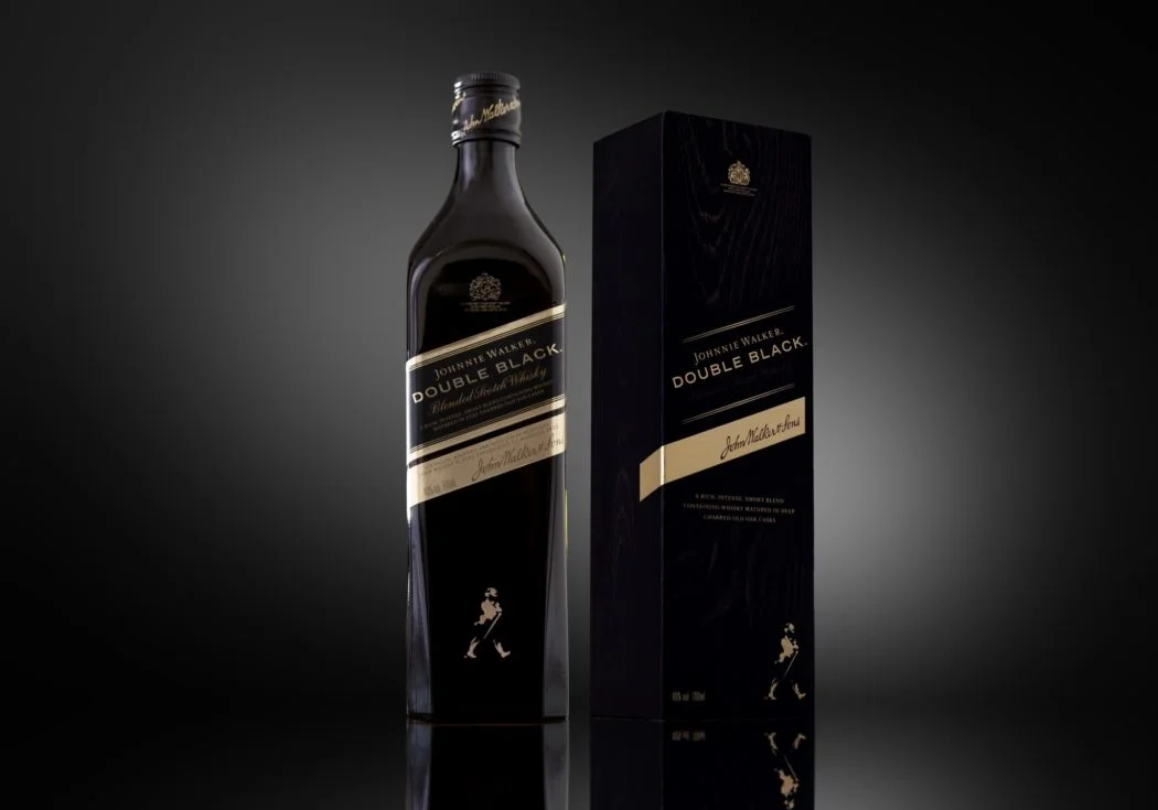
Johnnie Walker 'Double Black' is the darker, smokier interpretation of the famous Johnnie Walker ‘Black Label.’ The blend is matured in heavily charred casks - adding layers of complexity, smouldering spice and smoke.
Housed in a bespoke charcoal grey 'smoked glass' bottle, to enhance the intense experience of the whisky.
Russian Standard Vodka’s brand extension into fruit infusions was inspired by the traditional ‘nastoyka’ tinctures, popular in Russia during the 17th century.
A veil of ripe orchard fruits wrap around the bottle, allowing the intense colour of the liquid to shine through.
Art direction for De Luze cognac, reflecting their new ‘edgy, urban and dynamic’ brand positioning.
This new look and feel aligns with their social media campaign #DeLuzeYourself. Expressive and vibrant whilst remaining true to its timeless and sophisticated cues.
Gift set for Ren’s Rose Otto collection.
Inspired by the geometric pattern found in Moroccan design, this gift box celebrates the decorative art of this ancient culture.
The clean lines complement Ren’s ‘clean bio active skincare’ ethos in a modern compelling way.
‘Cylch Canol Llundain’ is a Welsh medium nursery in Central London.
Literally meaning ‘Central London Circle’, the identity fuses the fiery red dragon of Wales with the meandering river Thames, powering through the heart of the circle.
This exquisite website brings to life the passion and creativity of founder Olga Otrokhova.
Placing Cognac firmly in the woman’s realm, Monfleurie is a chic and luxurious spirit, with a feminine and floral twist. The launch edition is dedicated to the Orchid, a flower which perfectly embodies feminine beauty, power and love.
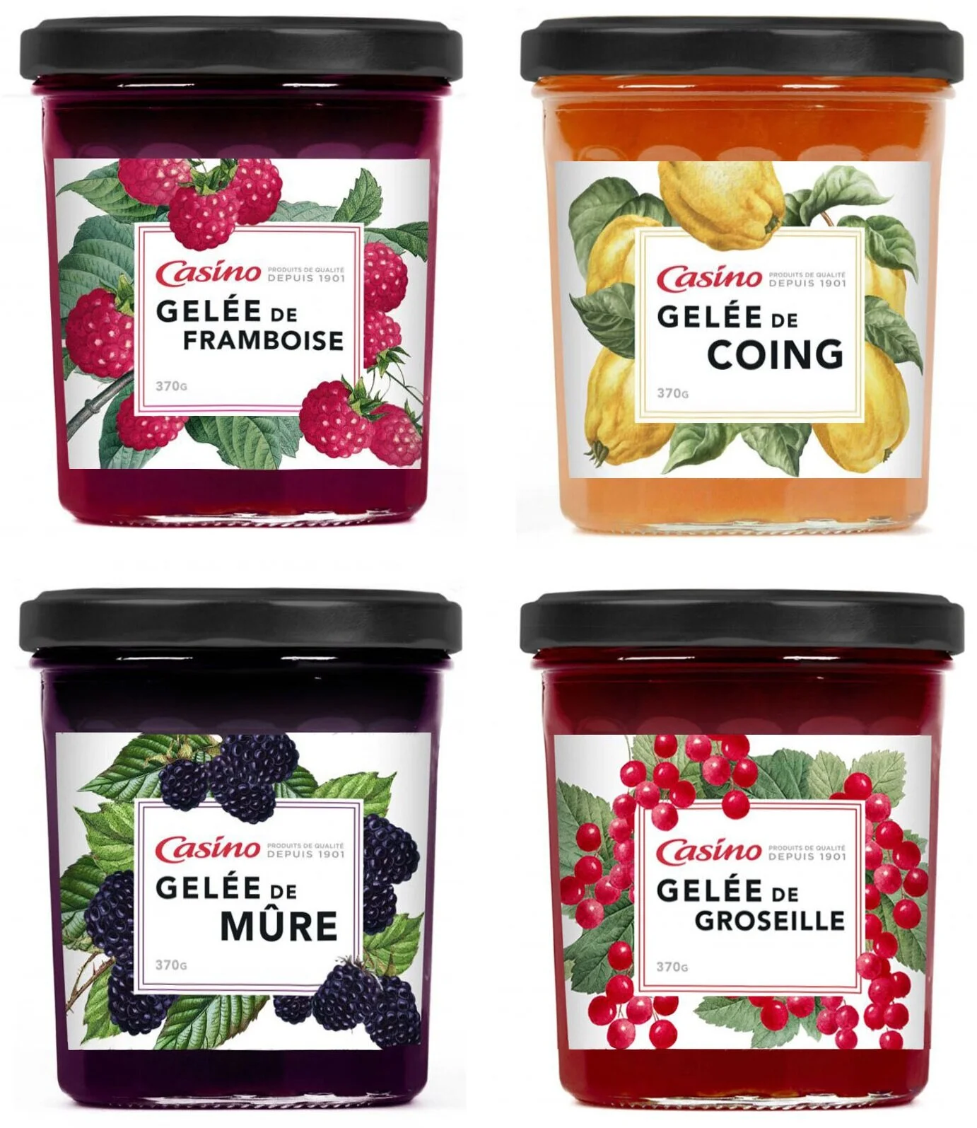
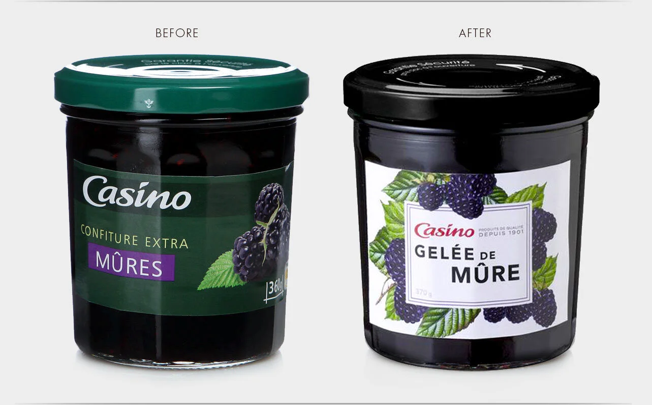
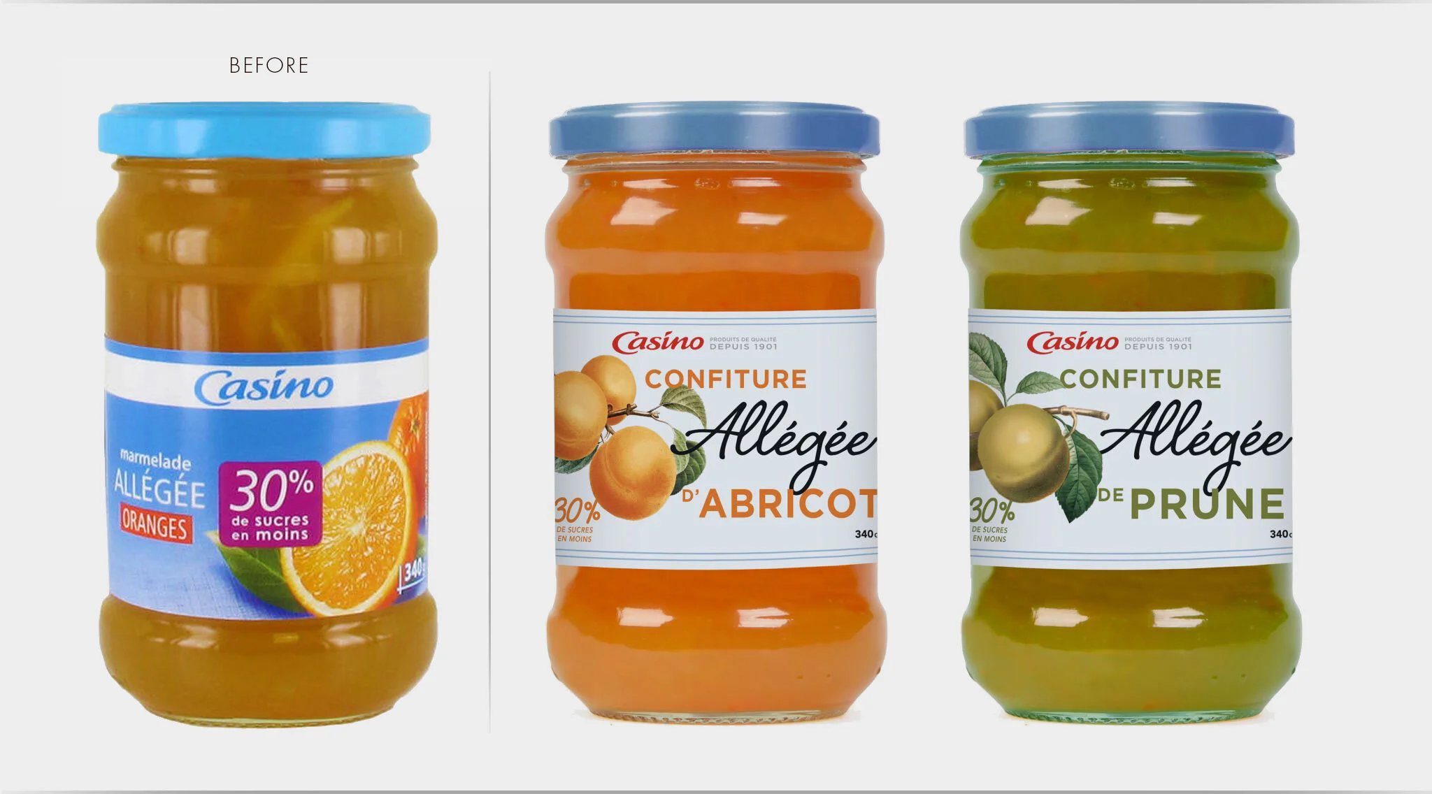
Adding heritage and gravitas to the Casino private label.
Established in 1901, Casino is the go-to supermarket in France for essentials.
This new collection of conserves celebrates Casino’s heritage with a range of botanical studies. From functional to aspirational, the new range creates brand cohesion whilst honouring the unique character of each fruit.